" height="17.29829408574501px" id="gY7j5PK5Z" stroke-dasharray="" stroke-linecap="butt" stroke-linejoin="miter" stroke-miterlimit="10" stroke-width="0.18" stroke="rgb(28, 27, 31)" transform="translate(0 1.35)" width="20px"/></svg>)
" height="19.599429945629137px" id="gznmL3Ir3" stroke-dasharray="" stroke-linecap="butt" stroke-linejoin="miter" stroke-miterlimit="10" stroke-width="0.4" stroke="rgb(250, 250, 250)" width="19.599206569765503px"/></g></g></svg>)
" width="13.878687516764664px"><path d="M 1.837 0 L 8.138 0 C 8.619 -0.001 9.081 0.188 9.422 0.528 L 13.351 4.456 C 13.69 4.797 13.88 5.26 13.878 5.741 L 13.878 18.163 C 13.886 18.652 13.69 19.121 13.338 19.46 C 12.999 19.812 12.529 20.007 12.041 20 L 1.837 20 C 1.33 20 0.901 19.822 0.54 19.46 C 0.188 19.121 -0.007 18.652 0 18.163 L 0 1.837 C 0 1.33 0.178 0.901 0.54 0.54 C 0.879 0.188 1.348 -0.007 1.837 0 Z M 1.633 18.367 L 12.245 18.367 L 12.245 7.755 L 8.98 7.755 C 8.184 7.755 7.512 7.479 6.956 6.921 C 6.41 6.392 6.108 5.659 6.123 4.898 L 6.123 1.633 L 1.633 1.633 Z M 4.898 15.306 L 6.939 15.306 C 7.177 15.306 7.366 15.384 7.521 15.54 C 7.677 15.693 7.762 15.904 7.755 16.122 C 7.762 16.341 7.677 16.552 7.521 16.705 C 7.368 16.861 7.157 16.945 6.939 16.939 L 4.898 16.939 C 4.68 16.945 4.469 16.861 4.315 16.705 C 4.16 16.552 4.075 16.341 4.082 16.122 C 4.082 15.885 4.159 15.695 4.315 15.54 C 4.469 15.384 4.68 15.299 4.898 15.306 Z M 4.898 11.224 L 8.98 11.224 C 9.217 11.224 9.407 11.302 9.562 11.458 C 9.718 11.611 9.803 11.822 9.796 12.041 C 9.803 12.259 9.718 12.47 9.562 12.623 C 9.409 12.779 9.198 12.864 8.98 12.857 L 4.898 12.857 C 4.68 12.864 4.469 12.779 4.315 12.623 C 4.16 12.47 4.075 12.259 4.082 12.041 C 4.082 11.803 4.159 11.613 4.315 11.458 C 4.469 11.302 4.68 11.218 4.898 11.224 Z M 12.245 5.655 L 8.222 1.633 L 7.755 1.633 L 7.755 4.898 C 7.755 5.239 7.872 5.533 8.108 5.769 C 8.344 6.004 8.639 6.123 8.98 6.123 L 12.245 6.123 Z" fill="rgb(28, 27, 31)" height="20px" id="Dgi7TNAuD" stroke-dasharray="" stroke-linecap="butt" stroke-linejoin="miter" stroke-miterlimit="10" stroke-width="0.41" stroke="rgb(250, 250, 250)" width="13.878687516764664px"/></g></svg>)
Enter Password
Enter the password to continue. If you don't have it please contact me
Enterprise Design System · Ameriprise Financial · Fintech
Introduction
Ameriprise runs two very different experiences under one brand: Client, the simple, guided app individual investors use to track their money, and Advisor, the denser, data-heavy tool financial advisors use to manage it for them.
Both had their own design system. Neither was maintained.
It wasn't really a design system problem. It was a decision problem.
Every small UI choice turned into a debate. Patterns weren't shared. Components couldn't evolve. "If it's not in the library, we don't build it" was the unofficial rule, which in practice meant: build it yourself, quietly, and hope no one asks.
Client and Advisor were supposed to share a foundation. Instead they drifted further apart every quarter and across 15+ products built on top of them, that adds up fast.
So I pushed to rebuild the system into something teams would actually use.
This project has been anonymized for confidentiality.
No governance, no system: two themes drifting apart, nobody owning either.
Every small UI choice became a debate nobody had authority to settle.
Inconsistencies slowed down delivery.
Rebuilt the system from the inside out.
Defined tokens, patterns, and rules that map straight to code.
Focused on adoption over completeness.
40% faster design-to-dev handoff.
50% of redundant component code gone.
2× faster cycles, 100% WCAG AA.
Process
Setting the scene
A design system already existed, one theme for client, one for advisor, visually nothing alike, and nobody maintaining either. The component library was too limited to be useful and too rigid to evolve, so "if it's not in the library, we don't build it" became the default answer to most things. Teams argued, hacked around it, or shipped it anyway. Delivery slowed. Issues piled up.
That was the state of things when I joined.
It was clear this wasn't sustainable. So I pushed for a proper design system, not an easy sell, but the need became obvious fast.
👀 This was never really a component problem. It was a decision problem wearing a component problem's clothes.

Standard conversation between designers
Constraints
No one was working on the system full-time, so aiming for a “perfect” system wasn’t realistic. For us, the biggest goal was adoption, and that meant making trade-offs.
I worked closely with developers to accelerate setup. Instead of building everything from scratch, we agreed to use existing foundations what already existed, Figma, Storybook, React underneath instead of rebuilding from zero, and align the UI to brand rather than rearchitecting component logic.
The Foundations
We built the system on an Atomic Design approach, supported by a shared token system between figma and code.
I set tokens for color, typography, spacing, radii, and height, split into a three-layer structure:
Primitive: raw values
Semantic: meaning-based tokens
Component: specific overrides when needed
💡 Genuinely painful to set up. Paid for itself the first time a brand update propagated across the whole library instead of taking days of manual edits.

Systemic fixes
Some fixes I didn't want to turn into tickets that would sit in a backlog forever, so they went straight into the foundation instead.
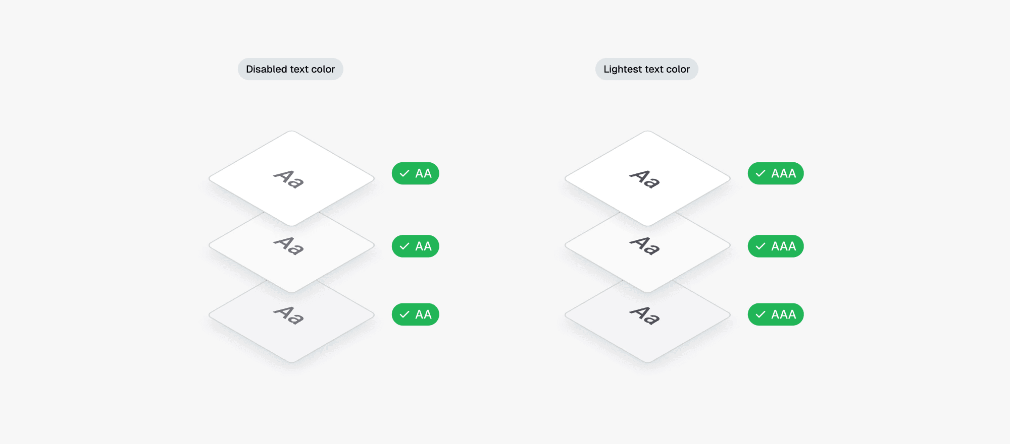
✓ Accessibility by default: color tokens set so every text-and-surface pairing passes WCAG 2.1 AA without anyone having to check.
✓ Safer destructive actions: one consistent pattern instead of every team handling delete/remove differently.
✓Predictable feedback states: the same system states behave the same way on both platforms.
Nobody had to opt in. It just came with the system.


Design Patterns
With the component base solid, now the focus area was Patterns.
I audited other design systems and our own products to define clear guidelines for recurring problems, areas with no single “correct” solution that were causing inconsistency and unnecessary debate.
Action hierarchy and button placement
Tables: filtering, sorting, bulk actions
Forms and validation
Cards.
Client and advisor used almost the same patterns underneath, the real difference was density.
Advisor screens carry a lot more data, so the same pattern had to flex without breaking.

Not clickable folders right now, PS: Still working on the files
Full workflow
Any designer working on a Design system knows it’s only as good as the frontend dev building it, luckily we had three good ones, so that part was never the risk.
We connected Figma to Storybook for web and Widgetbook for mobile through Supernova, which became the actual source of truth devs worked from day to day.
Then we pushed it further: Figma's Code Connect and MCP servers, so the system could feed AI-assisted code generation directly instead of a designer translating specs by hand.
My part there was mostly support:
Aligning naming conventions with code standards
Adjusting variants so they actually matched component props.

Documentation and enforcement
I assumed that once the guidelines existed, people would just use them. but no one really reads documentation. Shocking, I know.
So I got proactive:
Pushing proper component and pattern usage during design reviews
Nudging designers back toward the system instead of around it. Uncomfortable at first. Eventually it just became normal.
On the dev side, the frontend team ran Figma Dev Mode workshops so other devs could get comfortable working inside the system instead of guessing at it.

Results
40%
Reduction in design-to-dev handoff time.
Measured across both platforms, six months post-launch
Redundant component code eliminated by consolidating two libraries into one.
Faster feature development teams stopped rebuilding foundational components.
WCAG 2.1 AA compliance across every unified component, by default.
A design system is never really "done." But within six months, two platforms that used to argue about the same button were shipping off the same one and the debates that used to eat a sprint mostly just stopped happening.
Once a decision had one clear place to live, most of the debate around it just stopped — not because everyone suddenly agreed, but because there was finally something concrete to agree against. Talk to the people first. The tokens are the easy part.