" height="17.29829408574501px" id="gY7j5PK5Z" stroke-dasharray="" stroke-linecap="butt" stroke-linejoin="miter" stroke-miterlimit="10" stroke-width="0.18" stroke="rgb(28, 27, 31)" transform="translate(0 1.35)" width="20px"/></svg>)
" height="19.599429945629137px" id="gznmL3Ir3" stroke-dasharray="" stroke-linecap="butt" stroke-linejoin="miter" stroke-miterlimit="10" stroke-width="0.4" stroke="rgb(250, 250, 250)" width="19.599206569765503px"/></g></g></svg>)
" width="13.878687516764664px"><path d="M 1.837 0 L 8.138 0 C 8.619 -0.001 9.081 0.188 9.422 0.528 L 13.351 4.456 C 13.69 4.797 13.88 5.26 13.878 5.741 L 13.878 18.163 C 13.886 18.652 13.69 19.121 13.338 19.46 C 12.999 19.812 12.529 20.007 12.041 20 L 1.837 20 C 1.33 20 0.901 19.822 0.54 19.46 C 0.188 19.121 -0.007 18.652 0 18.163 L 0 1.837 C 0 1.33 0.178 0.901 0.54 0.54 C 0.879 0.188 1.348 -0.007 1.837 0 Z M 1.633 18.367 L 12.245 18.367 L 12.245 7.755 L 8.98 7.755 C 8.184 7.755 7.512 7.479 6.956 6.921 C 6.41 6.392 6.108 5.659 6.123 4.898 L 6.123 1.633 L 1.633 1.633 Z M 4.898 15.306 L 6.939 15.306 C 7.177 15.306 7.366 15.384 7.521 15.54 C 7.677 15.693 7.762 15.904 7.755 16.122 C 7.762 16.341 7.677 16.552 7.521 16.705 C 7.368 16.861 7.157 16.945 6.939 16.939 L 4.898 16.939 C 4.68 16.945 4.469 16.861 4.315 16.705 C 4.16 16.552 4.075 16.341 4.082 16.122 C 4.082 15.885 4.159 15.695 4.315 15.54 C 4.469 15.384 4.68 15.299 4.898 15.306 Z M 4.898 11.224 L 8.98 11.224 C 9.217 11.224 9.407 11.302 9.562 11.458 C 9.718 11.611 9.803 11.822 9.796 12.041 C 9.803 12.259 9.718 12.47 9.562 12.623 C 9.409 12.779 9.198 12.864 8.98 12.857 L 4.898 12.857 C 4.68 12.864 4.469 12.779 4.315 12.623 C 4.16 12.47 4.075 12.259 4.082 12.041 C 4.082 11.803 4.159 11.613 4.315 11.458 C 4.469 11.302 4.68 11.218 4.898 11.224 Z M 12.245 5.655 L 8.222 1.633 L 7.755 1.633 L 7.755 4.898 C 7.755 5.239 7.872 5.533 8.108 5.769 C 8.344 6.004 8.639 6.123 8.98 6.123 L 12.245 6.123 Z" fill="rgb(28, 27, 31)" height="20px" id="Dgi7TNAuD" stroke-dasharray="" stroke-linecap="butt" stroke-linejoin="miter" stroke-miterlimit="10" stroke-width="0.41" stroke="rgb(250, 250, 250)" width="13.878687516764664px"/></g></svg>)
OVERVIEW
Timeline
3 Months
Team
I collaborated with brand designer, project manager and developers.
Toolkit
Figma, Adobe Photoshop, Adobe Illustrator
BACKGROUND
Project Overview
Sorrentina is a premium food brand known for authentic Italian ingredients and ready-to-eat delicacies. While their products were high-quality, their existing e-commerce platform suffered from a cluttered interface and a disjointed user journey, leading to high drop-off rates at the discovery and checkout phases.
PAIN POINT
🔍Challenges
The original website felt overwhelming rather than appetizing. Key issues identified included:
Poor Discoverability: Users struggled to find specific product categories (e.g., dips vs. breads).
Lack of Visual Hierarchy: The home page lacked clear calls to action (CTAs), leading to "choice paralysis."
Inconsistent Branding: The digital experience didn't reflect the premium, artisanal nature of the physical products.
Who was affected?
It caused customers - there were almost no new visitors, and it wasn't easy to build enough credibility and authority.
Impact on the company
The old website didn’t provide the best possible user experience, and impacted the brand's image.
PROBLEM
🛑 Problem Statement
Process
🛠️The Design Process
I followed a user-centric design methodology to ensure the redesign was backed by data and user needs.
Phase 1
Stakeholder & Business Analysis
We begin every partnership with a kickoff workshop, During the day-long workshop with Sorrentina team, we examined the company's background, what problems the users were facing, and How can we help them to achive objectives, in this case, to boost revenue and enhance the User experience, to be able to identify opportunities, document requirements and business model. And what we wanted to achieve by redesigning and redeveloping the website. We also discussed the previous site map, revised its information architecture, and worked on the new, more clear, and functional one.
Phase 2
Methods
Based on our time and money constraints, the best method to better understand the user and their mindset when they are using e-commerce is through a discovery interview followed by user testing the current website. I am seeking to get a more in-depth understanding of the user’s motivations and everyday lives and more detailed answers.
Objectives
Discover the problems the users are facing to finalize the purchase.
The mental model of the users when they need to buy Italian food products.
Which steps they take when they need to buy something.
To build Recurring customers


Assumptions
Users who are intersted in Italian Cusine.
Users are not finding the website a legitimate platform due to inconsistency between payment and product page.
Even if the user completes the journey, they won’t come again because of this not so smooth journey.
Phase 3
Website Audit
To define how the content should be organized, what content includes, find out the navigation patterns, what value we can bring to the users, and create an understandable structure, we start auditing the website.
Current Website

Information Architecture:
It is the art of organizing, labeling, and structuring the content of our website in a meaningful way by following the mental model of our users. It helps to optimize our actual content and communicate effectively to our users.
For that, I've used the card sorting technique.
How we did the the card sorting?
It’s a methodology that allows us as UX designers to present the website’s content to our interviewees, and they will arrange the content into groups that make sense for them. I had the chance to conduct a card sorting with 6 participants after the users testing the current website to understand their mental model, using the optimal workshop. I gave them a few categories, and they were free to create a new category if they found it necessary. This kind of test is called hybrid card sorting. I have collected two forms of data, qualitative including participant’s comments and quantitative.

New Sitemap
I simplified the primary navigation to focus on core shopping categories. By reducing the number of top-level menu items, I decreased cognitive load, allowing users to reach their desired product in fewer clicks.

After brainstorming the solutions based on the user’s needs and insights, created low-fidelity wireframes to focus on layout, functionality, and user flow without the distraction of color.

Phase 4
Style Tiles
Developed "Style Tiles" to establish a sophisticated visual language - balancing rustic Italian charm with modern clean lines. I gave them some options:

Revamped Information Architecture:
I simplified the primary navigation to focus on core shopping categories. By reducing the number of top-level menu items, I decreased cognitive load, allowing users to reach their desired product in fewer clicks.
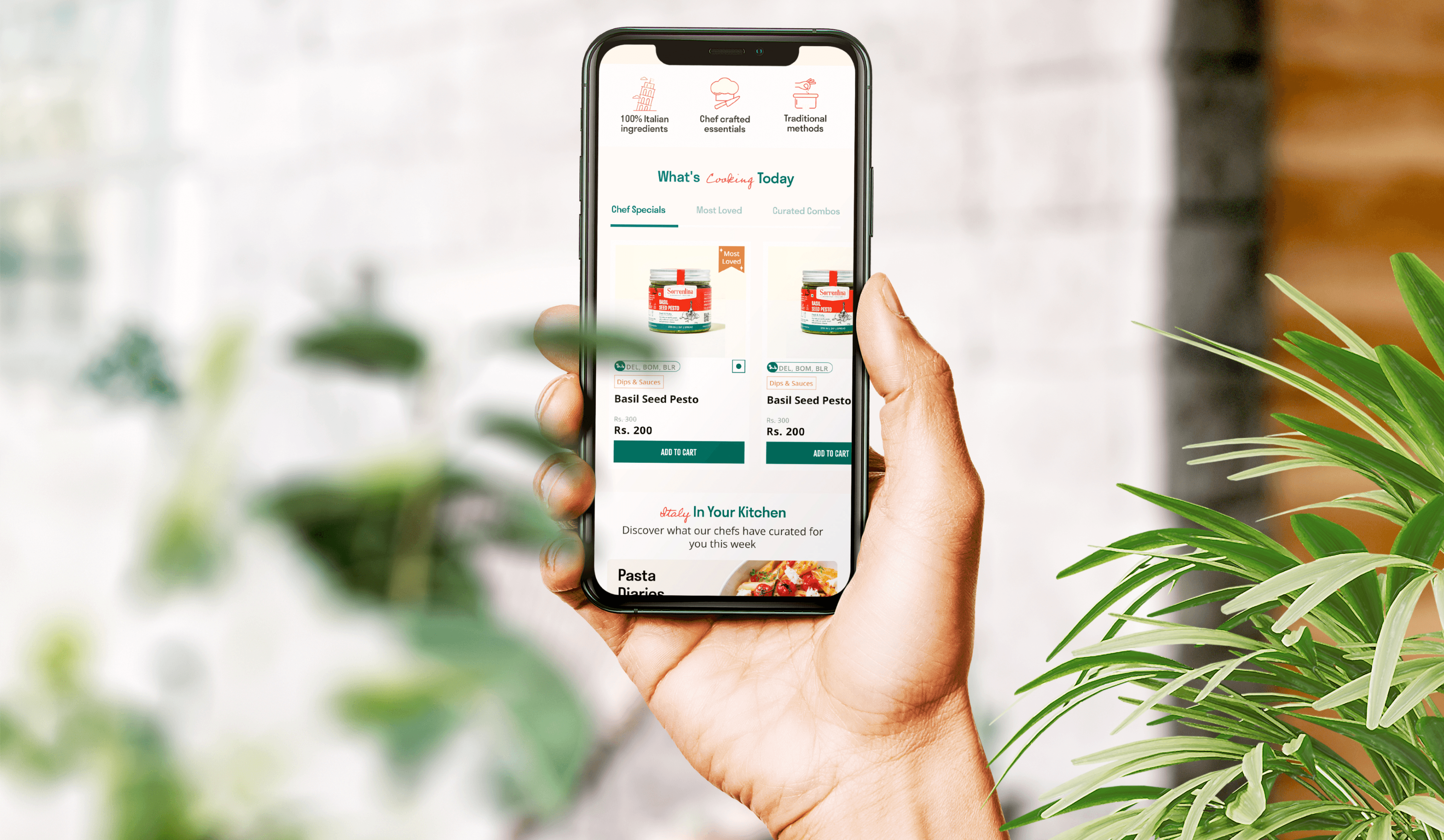
Enhanced Product Cards
The original product cards were cluttered. The redesign focuses on:
High-Quality Imagery: Making the food the hero of the page.
Clarity of Information: Clearly displaying price, weight, and "Quick Add" buttons to streamline the shopping experience.
Current Problem: Earlier the product card was not giving all the information which the user needs and also the colors and product image was over whelming. Some products are available across the country but some are restricted by area, how to communicate this information while maintaining inclusivity?

Optimized Checkout Flow
I streamlined the path from "Cart" to "Confirmation," removing unnecessary form fields and adding a progress indicator to reduce user anxiety during the transaction.
To minimize the challenges users encounter on their purchase journey, we redesigned the website so users can easily and intuitively navigate the categories finding the information needed to make a purchase decision.
Based on the user interview, most of the users have admitted to searching for products and viewing offers while on their mobile phones is difficult. Our site must be responsive.
The redesign successfully transformed Sorrentina from a basic online shop into a premium digital storefront.
What I learned:
Visuals Matter in Food UX: High-quality food photography isn't just aesthetic, it's a functional requirement for building trust and appetite.
Simplicity is Premium: For a high-end brand, "less is more." Removing distractions helped elevate the perceived value of the products.
Iterative Testing: Moving from low-fidelity wireframes to high-fidelity mockups allowed me to catch navigation friction points early in the process.